We thought it would be fun to go back in time to our very first SALT Gathering and see what the process, elements and concepts were of the SALT13 Set Design and Visuals. If you were at SALT13, you know how exciting it was to be a part of the very first gathering… and the anticipation for what’s to come never seemed to end. Here’s the concepts and visuals behind SALT13:
Every year we put together the creative elements of SALT, we discuss the following key elements: How do we tell a story? What is the central idea? and how do we enhance the environment around that idea to invite people into that story?
We are creating for a community of artists, technicians, thinkers and dreamers, so we want to come up with something that’s not just going to look cool to them, but resonate deeper than just aesthetics. Our environments are designed to echo the story we’re telling. (P.s. here are more detail on the tech specs of the SALT13 set)
The Theme/Story
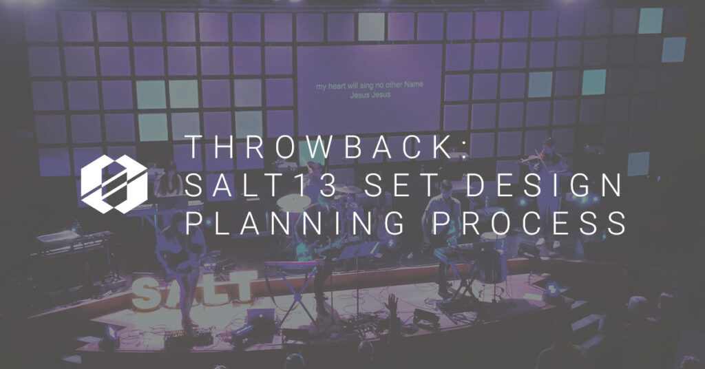
In 2013, our theme was Contagiousness. However our story mirrored the story of what God has done and is doing in our world in four parts: creation, fall, redemption, and recreation. We used the set and the visuals to illustrate this. The set went through several iterations during the course of the conference. When we saw it in the first two sessions, it had the form of a modular, grid-like structure. The main purpose of the set in this iteration was to use it to create a celebratory, exciting environment, mirroring the excitement and celebration that took place at creation.
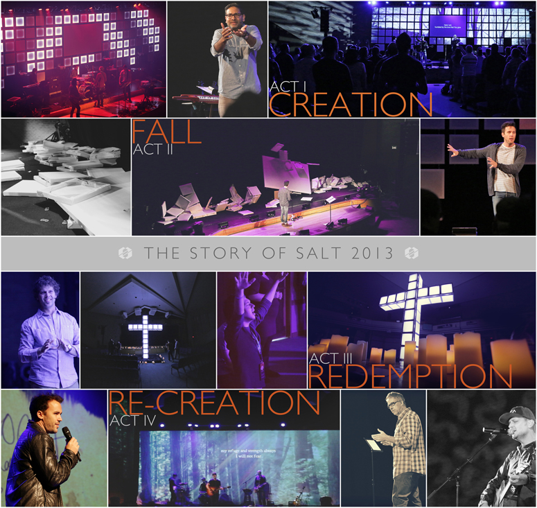
ACT I
To accomplish this story, we decided to create a set with dual functionality. The first function was to allow a set that would let us display beautiful projection mapped graphics and visuals. We aligned two 12,000 lumen projectors onto the set, and allowed us to play into the individual squares that made up the set. Here’s a look at that look:
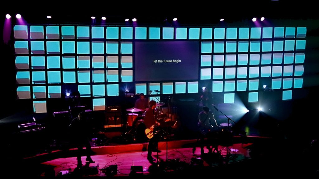
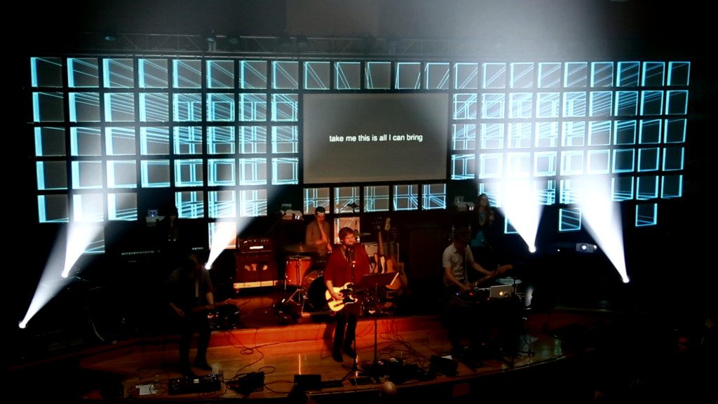
To accomplish our second functionality, we wanted to build a DIY, low-res LED Wall. Each panel was lined (inside the back frame) with white LED Strip Tape. This turned each square into an individually functioning pixel in the larger story. With Resolume and MadMapper, we were able to pixel map simple animations to be played across the entire wall. This was the entire basis for our set concept and visuals of sessions 1 and 2, which resembled the first act of our story: Creation.
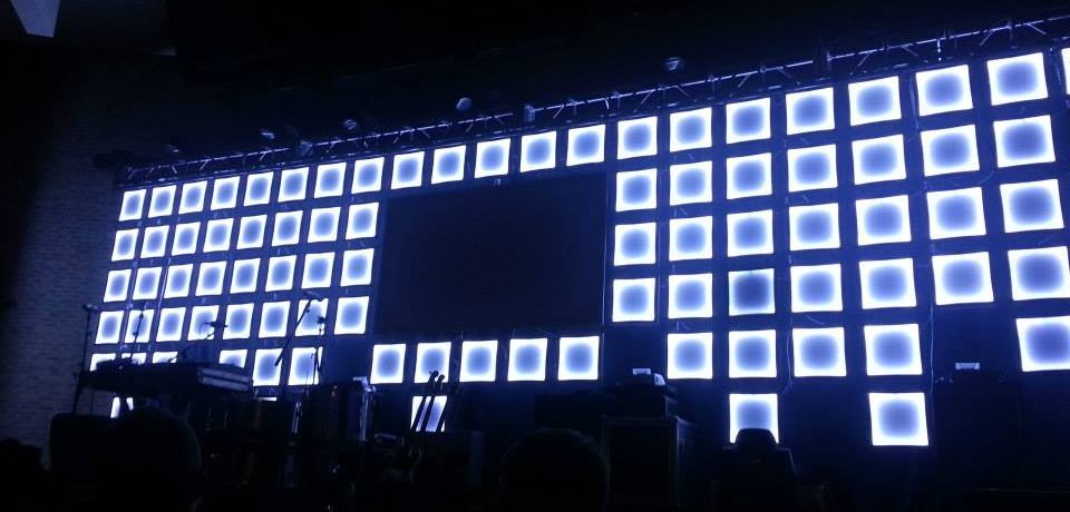
ACT II
For the second act, and the second iteration of the set, we had to represent The Fall. Our keynote speaker, Cole NeSmith completely destroyed the set, by allowing it to fall to the ground. This was to represent the fallenness we have when we try to be God, and control our environments too much; knowing full well that God will pick us up and put us right back where we belong, by his side. Here’s a video of that stunning portion of SALT13 :
ACT III
It’s important to note that at each act so far, the same elements were used. We really didn’t introduce new or different elements. So in the third iteration, we brought the set back (just as Jesus did with all our own brokenness), in the form of a cross. Many of the panels were actually destroyed, ripped and broken in the falling that took place during Act II, which brought an added depth to this new setup. Of course we used those broken panels anyway, because it represented the brokenness that was our sin on the cross, and how Jesus redeemed it for His glory and our Grace. This was representing the “Redemption” part of our story.
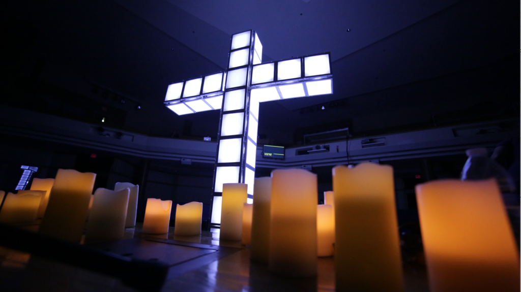
ACT IV
In our final iteration (the fourth act), we simply cleared everything out of the room and hung a simple white Cyclorama where the set once hung. This represented that Jesus gives us a blank state, post cross. A chance to re-create once again. We used environmental projection to cover both the cyc and the walls on either side, projecting graphics that asked our community to reflect and wonder on both their new identities in Christ as well as the journey they had been on that week.
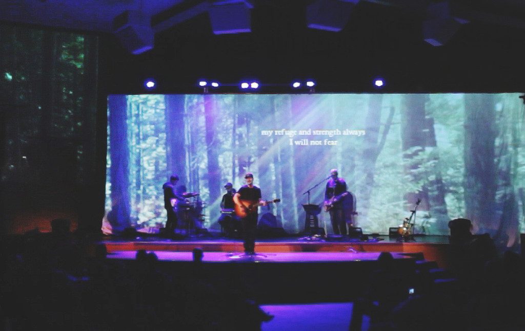
Using visuals to represent a story is one of the central ways we as artists are able to communicate and relate to our audience. Being intentional in how we choose and use these visuals — whether it be through set design, video, graphics, or other creative elements—allows us to focus on the most impactful way to tell our story. It also allows us to be intentional in how we share God’s story in our world and its relation to us as creative and technical people.
