Salt19 is a wrap, and we hope you had as great of a time as we did. The set design for SALT19 was a fun challenge. How to create an immersive experience that was both inspirational and practical all while driving the theme. Here’s a behind-the-scenes look at how we made it happen.
THEME
We always start with the theme when designing sets. What is the message we want communicated? With the theme of “For Such a Time as This,” we were exploring the concept of influence. We live in a world in which we are being inundated from every direction with information and content; people are primed to receive stories. Therefore, the church must leverage this time to use creativity to spread the gospel. Much like we are surrounded by voices, we wanted the set to be an immersive experience in which attendees felt engulfed in the design. We actually decided on this route before partnering with L-Acoustics, so when we joined forces with them and their L-isa system for immersive hyper-real sound, the communication of the theme really started coming together.
CONCEPT
Once we knew we wanted a design that extended into the house, we hit the drawing board. We reached out to Long Hollow, our wonderful host church, and began conversations about the set design. Rather than tear down everything that would already be on their stage, we decided to team together with Long Hollow’s production team to use their design as a jumping off point and build upon that to make our resources go further. They had mutiple LED squares, some vertical, some as a ceiling, with either LED panels or a quad of light fixtures inside of them. The LED strip squares were fully mappable and could be either an extension of the main video content or controlled separately. This square-heavy design paired extremely well with our brand guide, so we ran with it.
Limitations are the breeding ground of creativity. We had a very large room to work with, yet we wanted it to feel smaller. When it came time to start designing, I remembered a concert I had recently attended in which the artist’s small stage had gradually growing walls around it. Using that as inspiration, we looked at how to make it our own and further develop the idea. We used truss towers of incremental height reaching to the balcony to create a “bowl” around the attendees to give the illusion of walls.

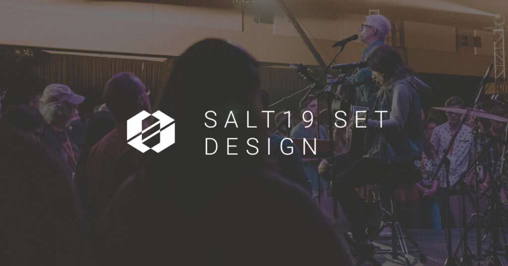
However, the set design didn’t stop there. With the use of satellite stages, we brought communicators closer to the people, helping break down the us/them barrier than can come with traditional stages. We had our main stage for most keynote moments, a central B stage for hosting moments and morning worship, and C/D stages for specific creative moments. The B stage provided an excellent place for intimate morning worship allowing attendees to engage in a more raw acoustic set. We used LED squares attached to kinetic motors over the B stage to create a ceiling to make the room feel smaller. We also replicated the squares on stage behind the C/D stages to reinforce the design through repetition. By using the squares behind the stages, in the air, and in lobby pieces, we were able to have a cohesive design throughout the conference.


EXCLUSIVE BONUS:
Get a FREE download checklist and video, 17 Ways To Improve Your Services from SALT Community. Click here to download
EXECUTION
Once we got on site, it was full-steam ahead to make this vision into reality. We built our truss towers of increasing heights and strapped Robin Robe Pointes on top of them. We had six more Pointes in the balcony to fully complete the globe of the room. Using custom-fabricated LED tape-lined aluminum squares and Elation SixPar 200s on pipe behind the squares, we replicated the non-LED squares that were already in the stage design. SixPars were also used to warm the trusses to add more vibrancy to the room. We then rigged kinetic winches in the air above the central B stage. Attached to those winches were more custom-made LED squares from the same fabricator. These were intentionally built to be able to flex more than what would seem standard to create unique shapes above the B stage. More static squares were hung above the C/D stages to beautifully highlight the communion tables during the final session. We linked in over sACN to the house rig of Chauvet MK2 Spots, Q-Washes, and Intimidator Trios along with front and house light on a Full Boar Hog 4 and were ready to roll. All in all, we used ten universes of lighting fixtures including an additional twenty-four universes for the mapping of the LED strips on the stage squares which was run through Resolume.


REFLECTION
My favorite part about this design is how it bred collaboration within our team. From minute one we partnered with the guys at Long Hollow to go at this as a team rather than us plowing in and making them take everything down or them refusing to let us do so. We collaborated together to highlight what their team was already planning on doing which allowed us to stretch our resources further to create a fully-immersive experience. Everything was done with intentionality. Even the crisp, simple walk-in looks were born from an energetic brainstorming session with the lighting director, Resolume operator, producer, and creative director. Just as this year’s theme explored the idea of influence and using creativity to reach the world for the gospel, this set reinforced that while we may live in a world of voices and distractions, the church can come together to point towards a single message.


