Every year at SALT Conference, our opener is a critical moment. It gives us a chance to unify the audience with a common experience, build anticipation for what God is going to do and kick off our story in a creative and thematic way. You may use the power of an opening moment in your worship environments as well, so we thought it would be fun to go back to SALT14 and breakdown our creative process around producing an opener.
At SALT14 we knew we wanted to have a big opening moment that illustrated the visual history of the church. Our theme was “rebuilding the walls of the church” as we studied the life and story of Nehemiah. In showing where the church as come from, we wanted to pick up where we were in current times, encouraging and inspiring our community to forge the future together. If you haven’t seen the opener from SALT14, take a look here:
The Concept
We always start with a brainstorming session between our core team. Bouncing all kinds of ideas off the wall, we make sure that the innovative use of technology always connects to the story, rather than just trying to do something that may be new for our community, we want it to impact people. So we eventually landed on the idea of an overhead projector that would come to life throughout the story.
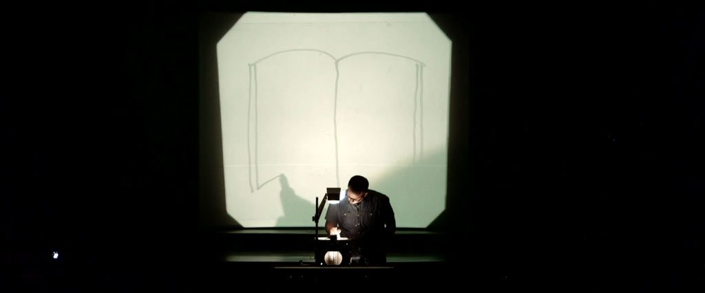
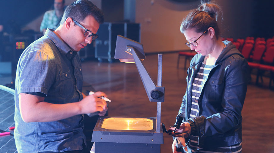
Here were the different projection techniques that we leveraged to tell this story: an overhead projector, environmental projection, and projection mapping. When the SALT attendees entered the room there was minimal lighting and a single overhead projector sitting on the floor. On it was the SALT Logo, hand drawn. This created mystery. A critical element in any opening moment for us.
As a music track and voiceover played, an actor approached the overhead projector, removed the transparency with the logo on it and began drawing a book. After he drew the book, the pages came to life and began flipping, resting on a blank page. A drawing of the early apostles then began animating on, with Seth drawing on extra embellishments relating to the animation.
This continued for several scenes until an image of stained glass drew on, which then spread from the small overhead screen onto the set, and then onto the walls, using a combination of projection mapping and environmental projection. As the story evolved from the original icons of the early church, we wanted to incorporate the inclusion of rich color, and immersive storytelling that is beginning to take shape in today’s modern worship environments.
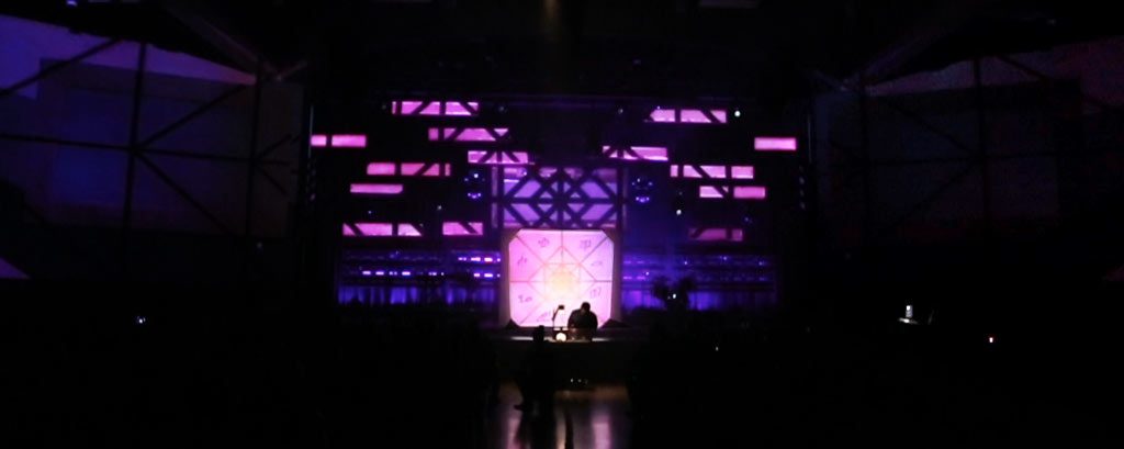
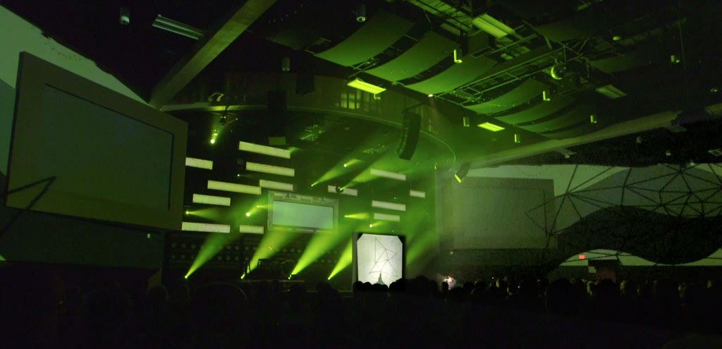
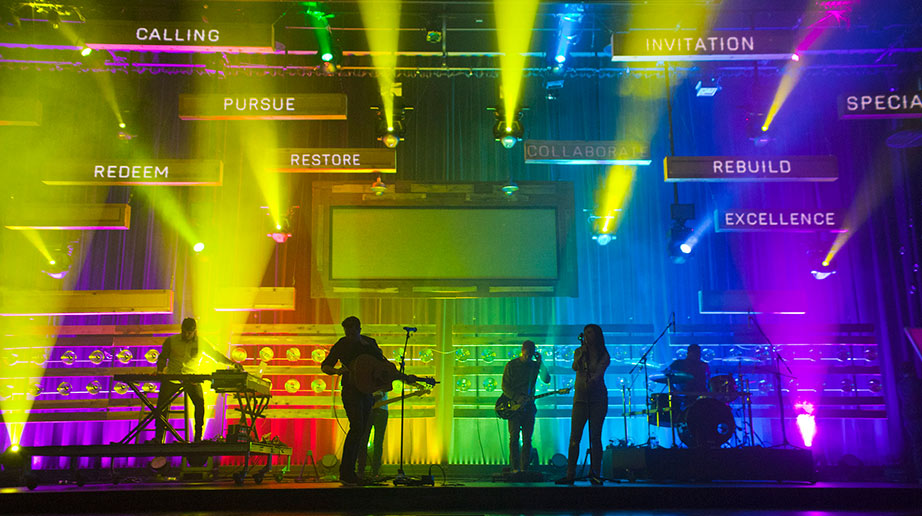
The opener ended with the band taking the stage and playing off the end of the music track while words emphasizing our calling as creatives in the church were projection mapped onto elements of the set.
The Execution
Pulling off something with this many elements took a bit of foresight and planning. Our team always starts with a pixel map. This gives us a foundation to create visuals and sets a standard for resolutions, etc. From there, we began creating animations according to that scale based on the resolution of the overhead projector, the pixel mapped set and the environmental projection.
All of the animations on the overhead started with physical drawings that were then animated in After Effects as a separate composition.
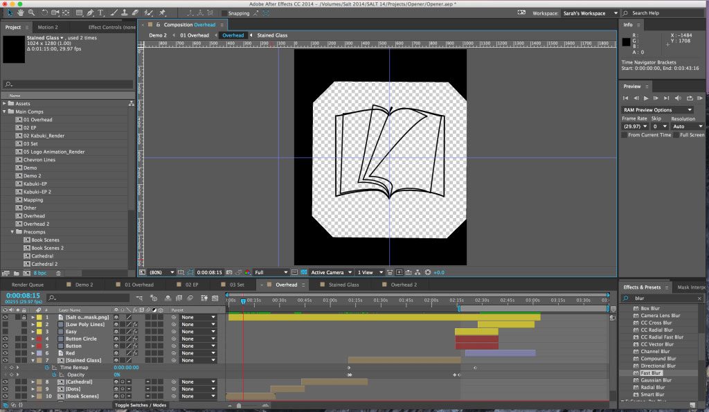
After merging the compositions together with the correlating raster of the entire pixel map, we were able to see the story as one canvas in After Effects. This made it easy for the animation to spread from the overhead to the set and ultimately end on the environmentally projected walls. Once all the content was finalized and exported from After Effects, we imported it into MadMapper and mapped all of the content to the physical surfaces of our set.
From our perspective, creating visuals for an environment needs to be very intentional, especially in a church setting. An audience member has been invited into an experience and everything that is happening in that environment needs to be cohesive and work together.
At SALT14, we used the different forms of projection for the opener because we felt like that was what was needed to emphasize the story we wanted to tell. However, we didn’t feel the need to use the projection continually throughout the rest of the conference even though it was still in place. As odd as it may seem, we never mapped the set again. That was reserved only for the opener, and allowed us to emphasize that moment for our community. Furthermore, the environmental projection was only used once more for a speaker’s keynote. Other than those moments, environmental projection wasn’t used again.
Sometimes less is more, and at the forefront of all service programming should be intentionally using technology to tell your story well. Just because you have something, doesn’t mean you need to use it. Using visuals to highlight certain moments will allow much greater dynamics in your storytelling and lead to a more cohesive experience.

